Introduction: Sales Promotion Mouse Pad, why is it always“Money spent, the effect is general”?
In the corporate promotional gift system, the mouse pad is almost“Evergreen tree” level of existence. Whether it is fair gifts, customer feedback, channel promotion, or employee welfare, mouse pad because of cost control, practicality, can be customized space is selected repeatedly.
But in the actual project, many enterprises will encounter similar problems:
The budget was spent, but the client didn’t spend much
Mouse pads start to curl, fade, and slip after a while
The LOGO has very little presence and limited promotional value
The product looks“Cheap” at first glance, which lowers the brand image
These problems are not isolated, but systematic mistakes in the design of promotional mouse pads. The mouse pad itself isn’t complicated, but because it looks so simple, it’s easier to overlook the details.
A truly successful promotional mouse pad should have three core values:
Willingness to use (not to be idle)
Used for a long time (on the desktop)
Remember (brand is constantly perceived)
This article will focus on these three objectives, the system dismantling promotional mouse pad design the most easy to step on the“Pit”, and can be implemented, can be landing to avoid the pit recommendations.
Second, cognitive misunderstanding: the promotion of mouse pad as a“Disposable consumables.”
Common misconceptions
Many companies already have a psychological label attached to their promotional mouse pads:
‘It’s a gift’
“Clients won’t care too much.”
“As long as I can print a LOGO.”
This knowledge has three direct consequences:
It lowers the unit price and doesn’t focus on the experience
The design is haphazard, with little overall planning
The lower limit of quality has been breached time and again
2. The opposite is true
The mouse pad is a highly used office tool:
6-10 hours per day
High frequency eye contact with hands
Exposure time is much longer than gifts such as flash drives and key rings
This means:
Once the mouse pad is left, its brand value is long-term and stable.
3. Avoid the trap
Don’t use the“One-off gift” mentality as a mouse pad
Think of it as“Long-term desktop media.”
The goal is not to“Give it away,” but to“Keep it.”
Third, the core mistake: excessive pursuit of low prices, ignoring the“True cost of use”
1. The hidden risks of the low-price strategy
The most common failure paths for promotional mouse pads are:
Unit price is very low → quality decline → users abandon → promotion failure
Common problems with low-priced products include:
Rough surface, affecting positioning
Insufficient skid resistance at the bottom
Smelly
After using for a period of time, it will fluff and fall off
2. “Usage cost” is more important than“Purchase cost”
From a marketing perspective:
Used = cost diluted
Unused = 100% wasted
A slightly higher unit price, but can use 1-2 years mouse pad, far better than a cheap but only 1 week products.
3. Avoid the trap
Set a minimum experience, not a minimum price
Give priority to basic handling, slip resistance, and durability within a manageable budget
Define“No sacrifice” quality bottom line with suppliers
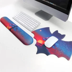
Design Pit One: size selection divorced from the actual use of the scene
1. The classic problem of being too small
The mouse frequently slides off the surface
User experience discomfort
Is quickly replaced or discarded
Especially in the current high-resolution screen and low-DPI operating habits, the small size of the mouse pad experience is obviously inadequate.
2. The hidden risks of being too big
You Can’t fit your desk
Conflict with existing desktop layout
Hard to carry, hard to distribute
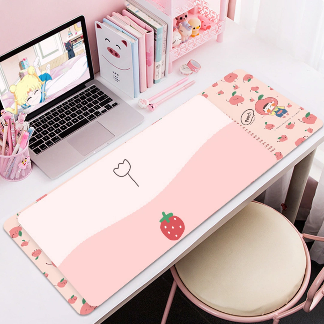
3. The size logic of different promotional scenarios
Exhibition distribution: thin, medium to small
Customer feedback: Standard or larger size
Key customer/employee gifts: Consider table mats
4. Don’t be trapped
Always follow one rule:
Size serves the use case, not the“Look-good”.
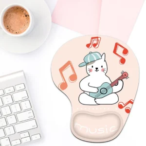
Branding mistakes: LOGO“Too much or too little”
1. Logo overload
Visually intrusive
More like advertising material than a gift
User psychological resistance to long-term use
2. The problem of too-small logos
Brands have very little presence
Users don’t remember brands, even if they use them every day
Common minefields of LOGO location
Right in the middle: affecting the operating experience
High-frequency sliding zone: visual distraction
4. Don’t be trapped
Logo suggestions in corners or around edges
Make it clear and legible, but don’t overwhelm
Let the brand“Exist naturally”, not“Forced exposure”
Design Pit No. 2: ignoring the practical limitations of the printing process
1. Screen effects ≠ physical effects
Common gaps include:
Dark colors turn dirty and gray
Gradient Fault
Thin lines blur
2. Consequences of poor process selection
Screen printing: limited color, complex patterns easily distorted
Low-end heat transfer: poor durability, easy to fade
3. Avoid the trap
Consider the limitations of the printing process at the design stage
Avoid thin lines and complex gradients
Proofing must be confirmed before mass production
Seven, material selection errors: only focus on the surface, ignoring the“Hidden problems”
1. Frequently asked questions about surface materials
The fabric surface is too thick, affecting the smoothness
The surface of the fabric is too slippery, and the sense of control is lost
2. Bottom texture is the key to“Deciding the experience”
The bottom problem often leads directly to abandonment:
Lack of skid resistance
Age hard
Traces of the desktop after use
3. Smell is not to be ignored
Recycled rubber smells bad
Poor initial experience
The indoor office environment is particularly sensitive
4. Don’t be trapped
Give preference to a stable rubber base
Determine if there is an odor control requirement
The bottom lines should be clear and gripable
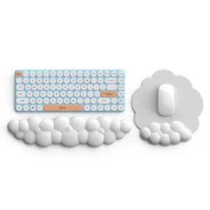
Thickness and edge treatment: the most overlooked“Texture details”
1. Common problems with thinness
Hemming after a few days
Lack of support
Give the impression of being cheap
2. Long-term risks left untreated on the margins
Fuzz
Flaking
Significantly reduced service life
3. Avoid the trap
Thickness not less than 2 mm is recommended
Key items may be considered for seaming
The edge is a“Silent but deadly” point of mass
Packaging design mistakes: either no or too much
1. The issue of full nudity
Unprofessional branding
It is easily distorted in transportation
Poor first impression
2. The paradox of over-packaging
Rising costs
Doesn’t match the promotion
3. Avoid the trap
Opp Bag + card is a cost-effective solution
The packaging style and mouse pad design are unified
Packaging is the“First contact” of promotion
Ten, ignore the user difference, is an important reason for the failure of sales promotion
1. Different objects, different strategies
Employees: Practical, durable
Client: Focus on brand and design
Exhibition: Light Weight, distribution efficiency
2. Dodgy advice
Don’t please everyone with one mouse pad
Design logic based on crowd splits
When the budget is limited, priority should be given to the core objects
Systematic dodging list of promotional mouse pad design
Clear usage scenarios
Set minimum standards for experience
Control the presence of the LOGO
Match the right printing process
Pay attention to bottom skid resistance and odor
Control thickness and edge quality
Unity of packaging and branding
Reverse design from the perspective of“Being used”
Conclusion: the real success of the sales mouse pad, is the“Long-term brand equity to stay”
Promotional mouse pad is not a simple gift, but a low-cost, high-frequency, long-term brand media.
A properly designed mouse pad can stay on a user’s desktop for years
A single design mistake can mean zero marketing value for the entire project.
The essence of avoidance is not to increase costs, but to spend money where there is real value.